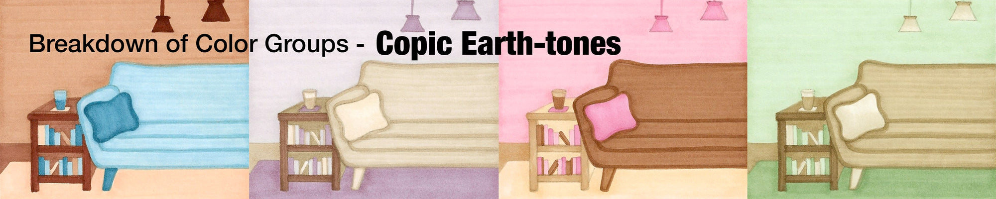

Greetings Copic readers! In our previous blog, we discussed one of the “other” Copic colors: Gray, and what the differences are between the four different types. Today, we’ll be taking a closer look at one more “other” Copic color: the Earth-tones, and how each of the 9 color groups within this family are different from each other. With that being said, let’s get started by taking a look at the Color Swatch Cards below!
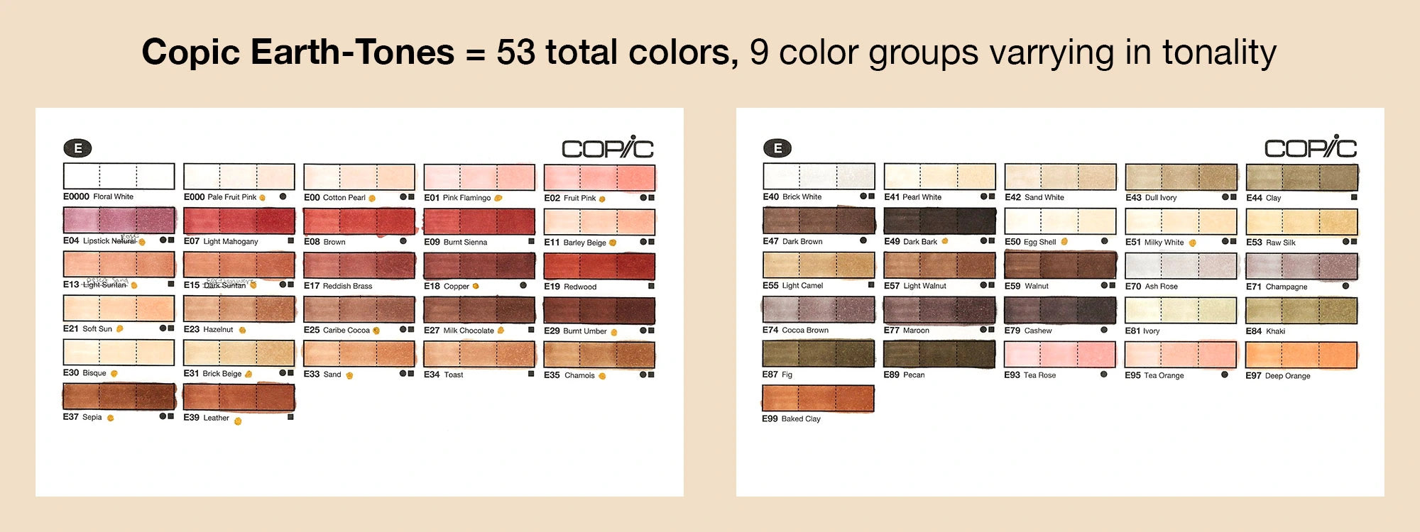
One of the easiest ways to see the differences between the Copic Earth-tones is by seeing the swatches on paper. Above are the two Copic Color Swatch Cards consisting of the entire Earth-tone color family. On the left card are the more “saturated” browns, meaning that these colors are brighter and more vibrant. On the right card are more “dull” browns, meaning they have less saturation and are less vibrant.
Depending on what you’re coloring, and on your personal preferences, you may want a more peachy, red-undertone brown, and for that I would look for an earth-tone starting with 0, 1, 2, or 3. The first number, in fact, of the entire Copic Color System, represents the color’s saturation level. Color numbers that start with 0 are the most saturated or vibrant of that given color family (violet, green, earth-tone, etc.). On the flip side, color numbers that start with 4, 5, 6, and so on, indicate that the color is not as saturated, with 9 being the least saturated of any given color group.
Looking back up at the Earth-tone Color Swatch Cards, the color groups that start with 7 and 8 really stand out as “dull,” unsaturated browns. However, just because these colors are dull, doesn’t mean they can’t be useful in anyone’s Copic collection!
Let’s take a closer look at the differences between the 9 different Copic Earth-tones by watching the time lapse video below!
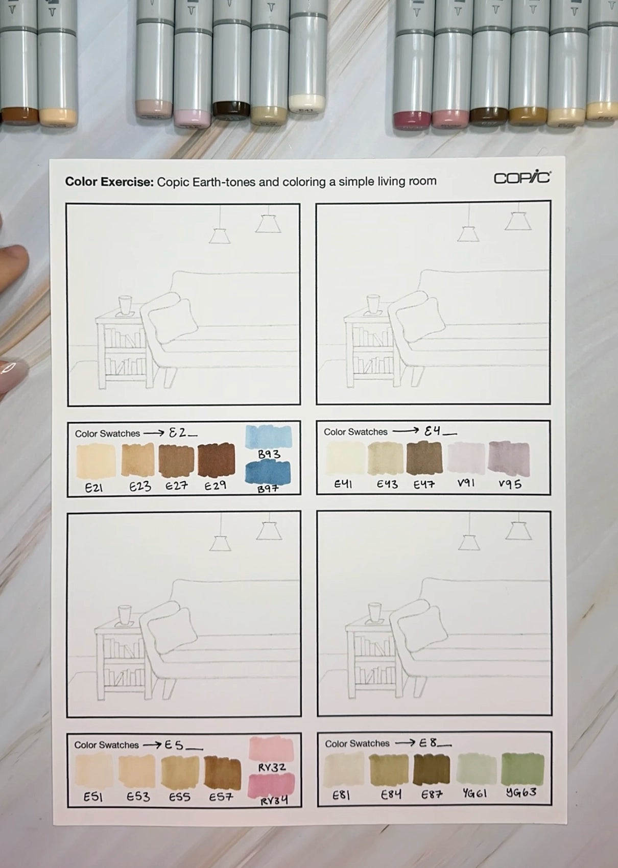
In this video, the artist used the practice sheet found in our line art gallery here to color a small living room drawing using 4 different Earth-tone color groups, each including colors of similar value - a light brown, two mid-tones, and a darker brown, along with 2 other colors to better illustrate the space and bring each panel its own unique personality.
In selecting the 2 other colors, I considered the saturation of the given Earth-Tone group (what number it started with), and how warm or cool the colors looked. Then, after considering those factors, I selected colors either around the same level of saturation, or the opposite to create more contrast. For example, in the bottom left panel, I chose dusty pastel pinks to accompany the E5_ group since these colors have a warmer chestnut feeling to them. Again, for the bottom right panel, I chose a “mid-century modern” unsaturated yellow-green, since the E8_ group had some dull, olive undertones to it. For the top left panel, however, I chose unsaturated B9_ blues to pair with the cherry red undertones of the E2_ group. Either method of choosing accompanying colors works, just take your time looking at all of your color options beforehand and make swatches if you need to!
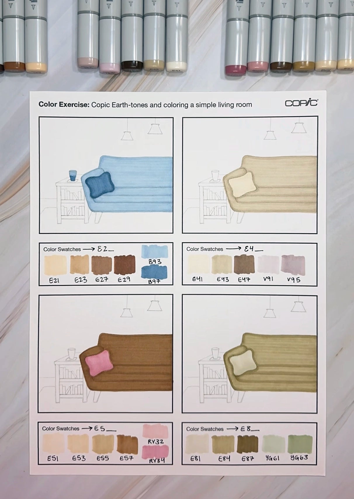
After swatching all of the colors, making sure they aren’t dry and need refilling, the artist began by coloring the couch first for each of the four panels. This was a personal preference, you can definitely start with the background or table first if starting out with the couch feels too intimidating. By starting out with the couch though, it was easier to determine the colors for the rest of the scene in order to keep the couch the most prominent part.
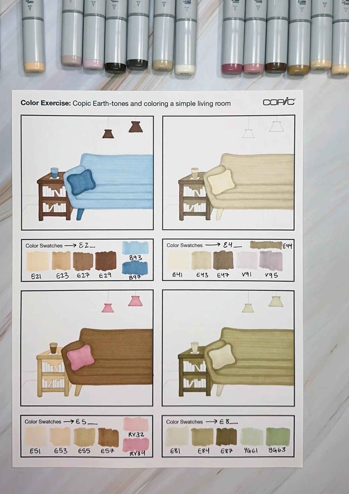
After coloring the couch, the artist began to color each book table and the small light features above. Since most of the couches are a light to mid-tone color, except for the lower left panel, the accompanying table for each was colored using darker tones. For the darker couch, a lighter wooden table was colored, keeping in mind contrast and how the color values would look placed next to each other.
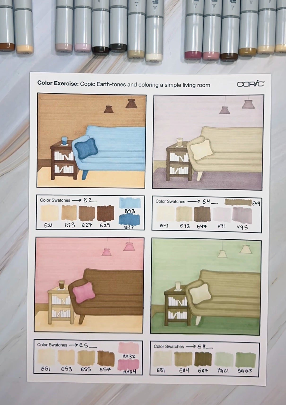
Next is a very dramatic step, coloring the wall and flooring. Again, depending on how light or dark each living room is up to this point, the artist selected color values that would go well with the rest of the scene. For example, in the top left panel, the floor was colored with a light E21 and the wall with a darker E23. These two colors could be reversed too, with E21 on the wall and E23 for the carpet. Either way, these colors were chosen since they don't compete directly with the dark book table and the light blue couch. The same goes for the panel to the right of it, where the wall was colored with a very pale V91 and the carpet below a darker mid-tone V95.
Last but not least, we have the small details to color and an extra outline layer for each couch. For the tiny books in each table, the two extra colors that were selected to accompany each scene were colored at random, along with one of the Earth-tones in the group. This way, one more splash of color is added to the scene and your eye can rest on the couch and solid-colored wall behind it (although you could turn the wall “paint” to a “wallpaper” pattern if you wanted to zest up the scene some more!).
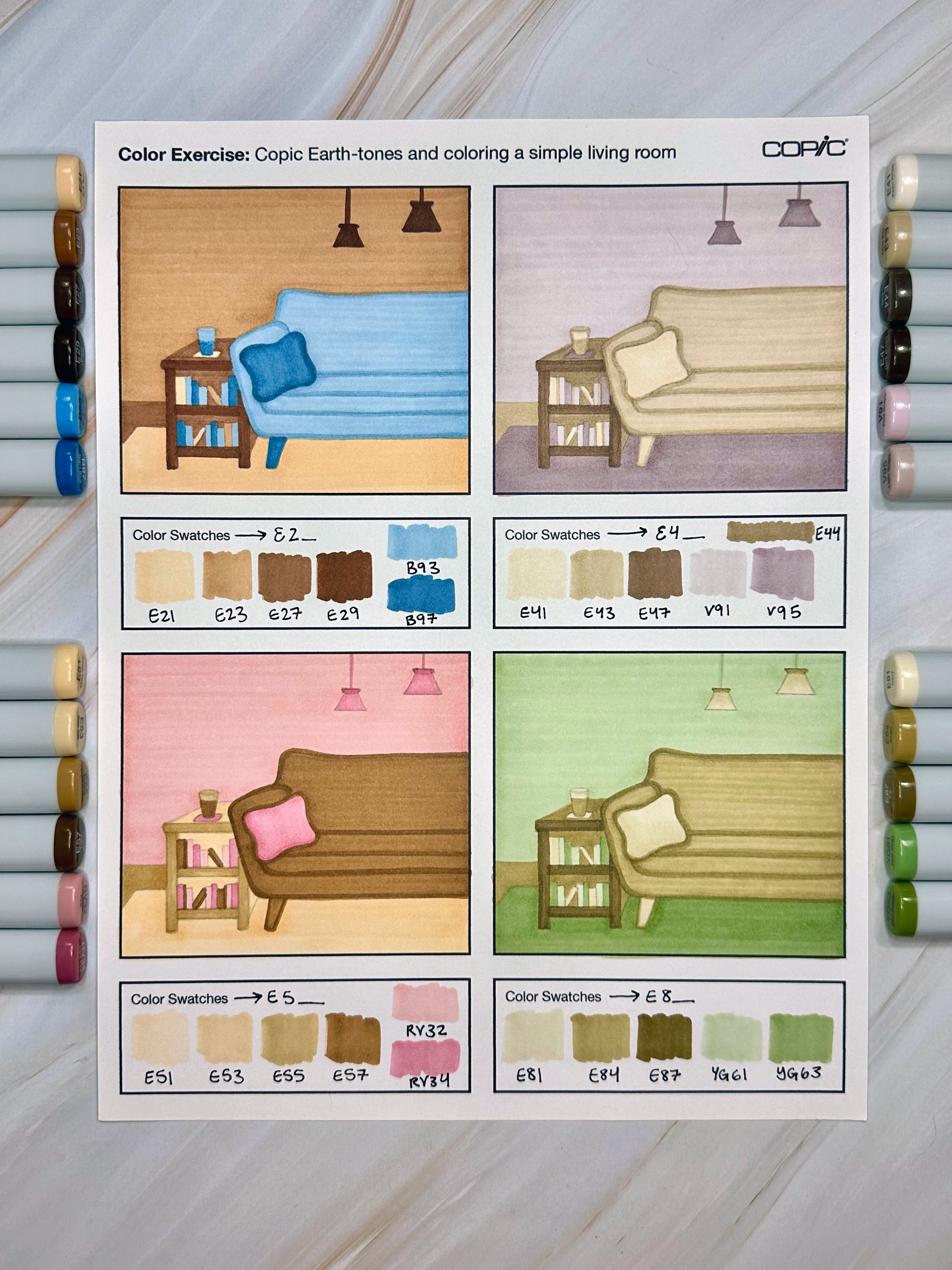
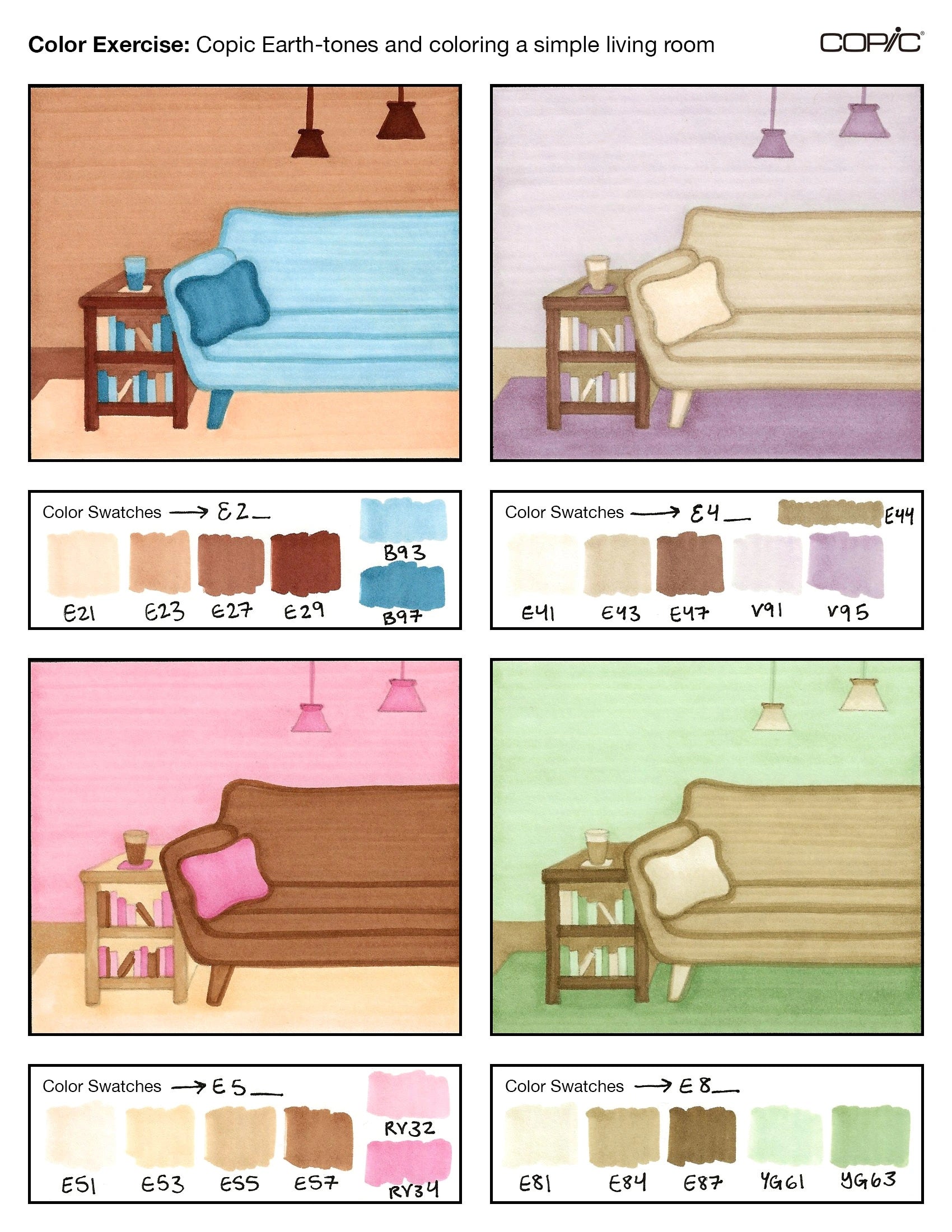
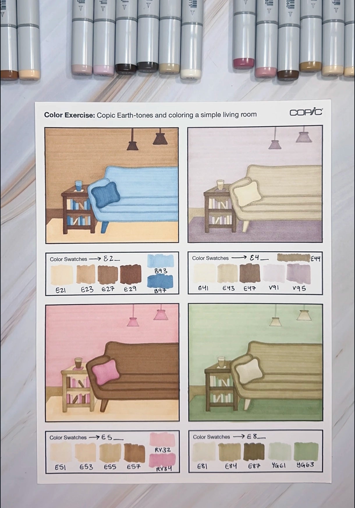
And with that, we have our completed color exercise sheet! From the scanned image above, we can see the differences between the saturation level of each Copic Earth-tone group. Each of them has great blending capabilities and can be matched with a variety of different colors - choosing which one is “right” for you depends on your personal preferences and, of course, what subject matter you’re illustrating.
Personally, one of my favorite Earth-tone color groups is the E4_ group (used in the top right corner). There are 7 colors within this group (E40, E41, E42, E43, E44, E47, and E49), and since they’re less saturated, they’re often overlooked. I find them to be very useful in my sketchbook, and they fit well with the type of art I like to make. However, they may not be everyone’s favorite, so try out each of the Copic Earth-tones yourself to determine which group in this large family of 53 total colors you like most!
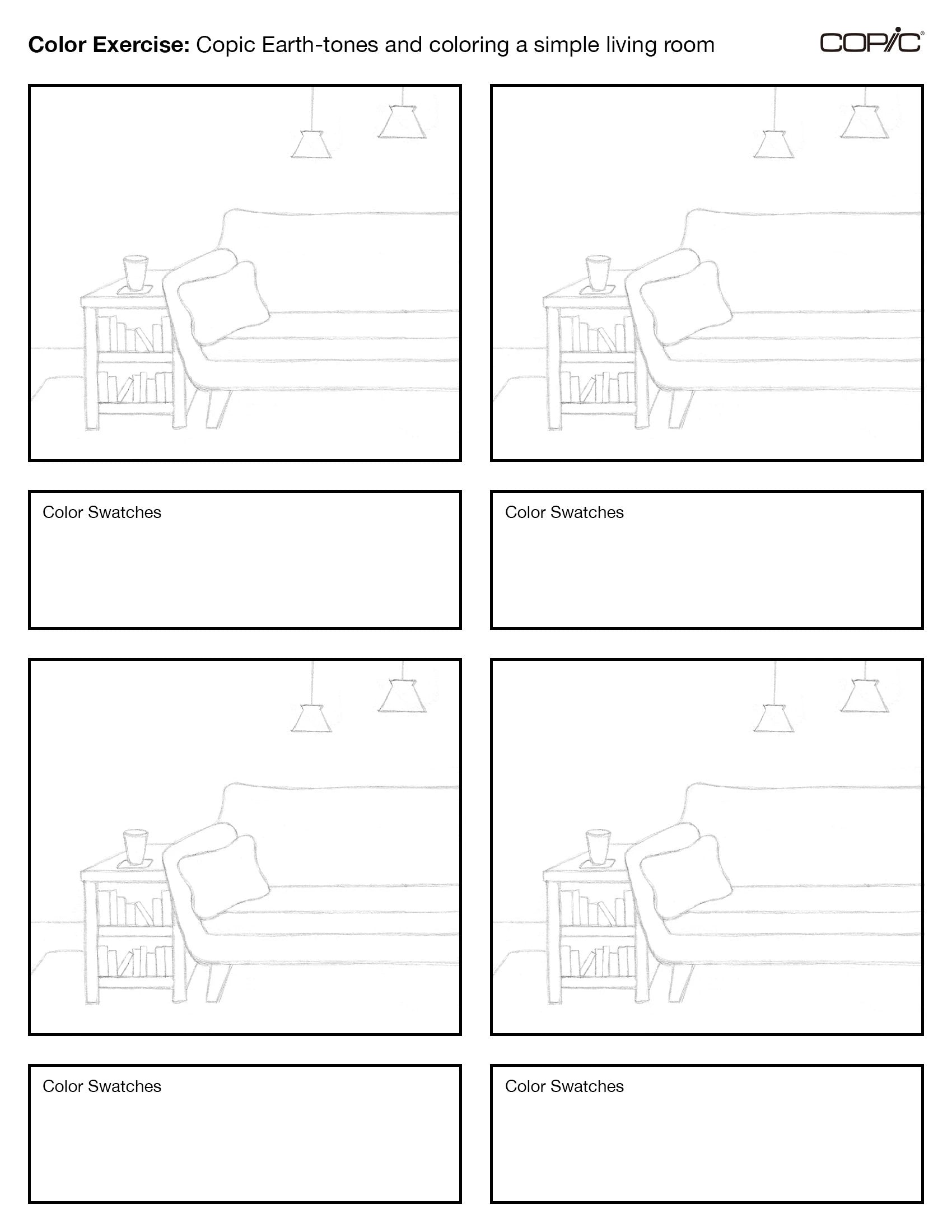
Also, please download the above template here in our line art gallery if you’d like to give this Earth-tone coloring exercise a try yourself!
—
And with that, we wrap up today’s blog! Stay tuned for next month, where we’ll go into detail on the Staple Copic products: Markers, Pens, and Ink.
Until then, don’t forget to follow us across our social media channels @copic_official_us, and sign up for exclusive discounts and prizes by joining the Copic Club! One last thing - use #copicwithus or tag us @copic_official_us for a chance to have your drawings featured on our Copic US social media channels and the homepage on our website!
Thank you so much for reading and enjoying Copic markers as much as we do! 😀