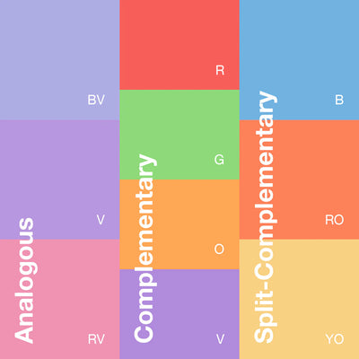
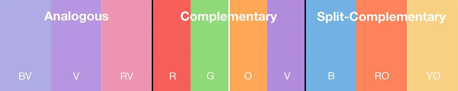
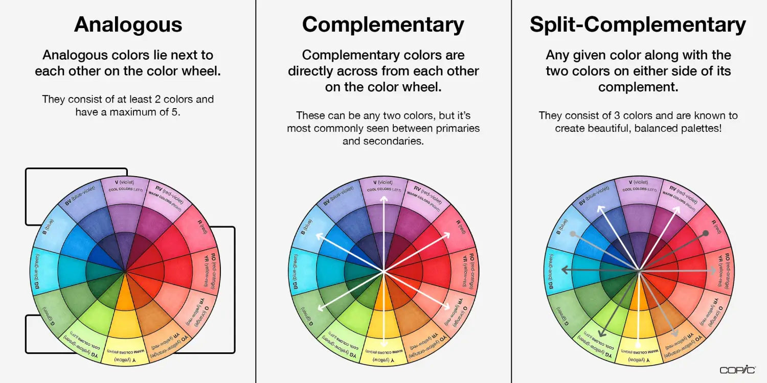
Analogous, Complementary, and
Split-Complementary
How can I create a color palette for mydrawings that will look good together?
As we discussed in the previous blog, it’s easy to see that the color wheel is split into 6 warm and 6 cool colors. But there are plenty of other ways you can group colors together with the help of the wheel! In this blog, we'll explain three different color schemes: analogous, complimentary, and split complementary. By understanding each of these color schemes, you’ll be able to quickly and easily choose Copic colors in whatever composition you’re coloring!
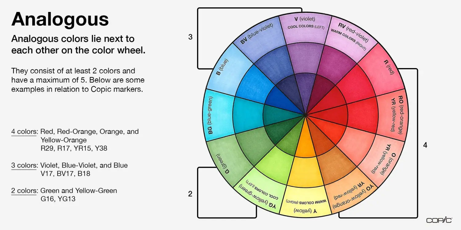
First up, we have analogous. Analogous colors lie next to each other on the color wheel, for example, blue, blue-violet, and violet are pretty much guaranteed to be harmonious due to their proximity. The most common grouping of colors in an analogous color scheme is 3, however, they have to have a minimum of 2 colors but a maximum of 5, otherwise, you’re just using half the color wheel!
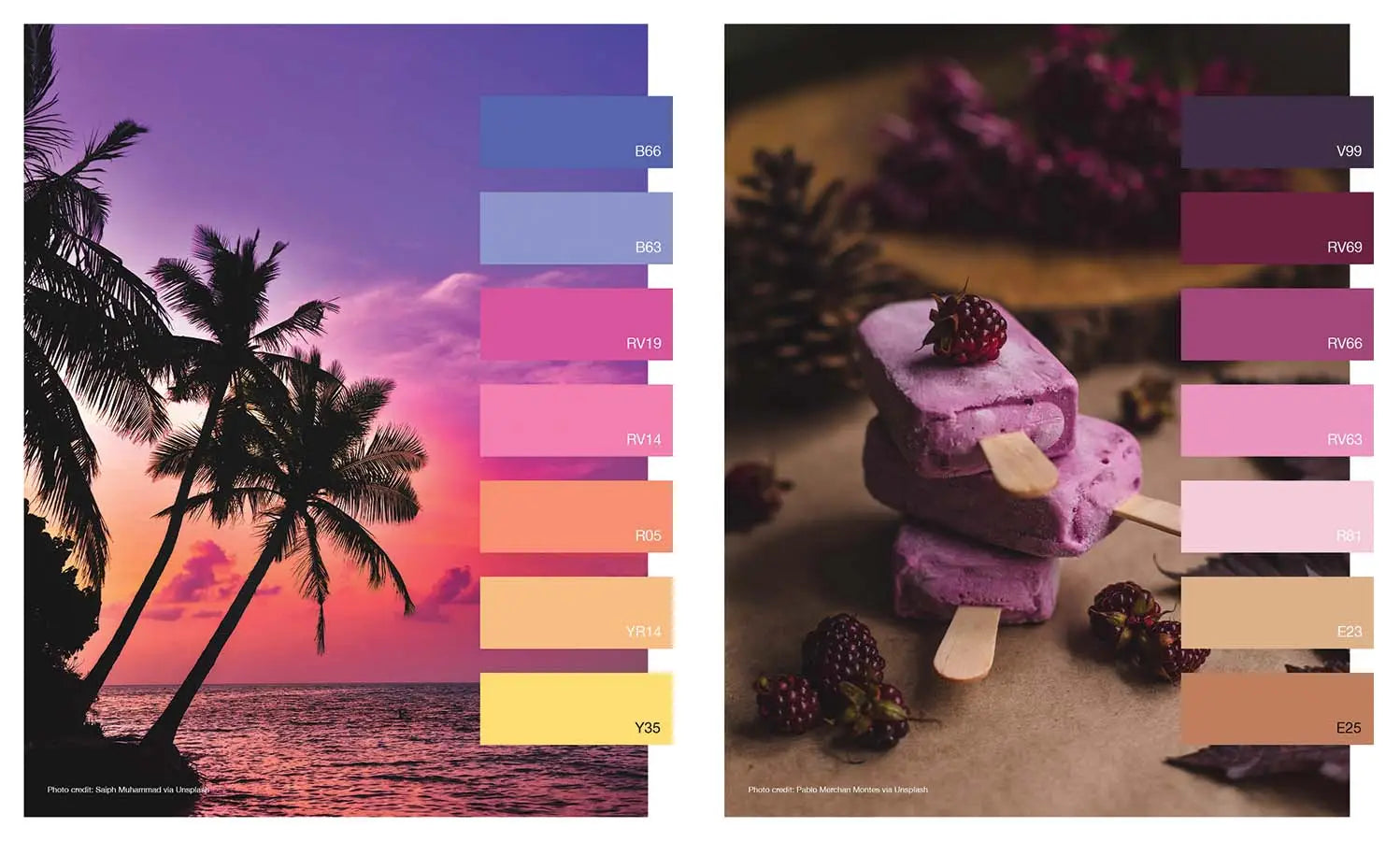
Let’s take a closer look at the sunset and dessert images above. The blue-violet sky at the top of the photograph flows effortlessly into a periwinkle violet, then a light red-violet, then a vibrant red, etc. The sherbert image to the right shows a transition from a dark plum violet to a saturated peony red-violet to a pale-rose red. Both of these images show a gradual transition from one color to the next on the wheel, and for that reason, they’re both using an analogous color scheme!
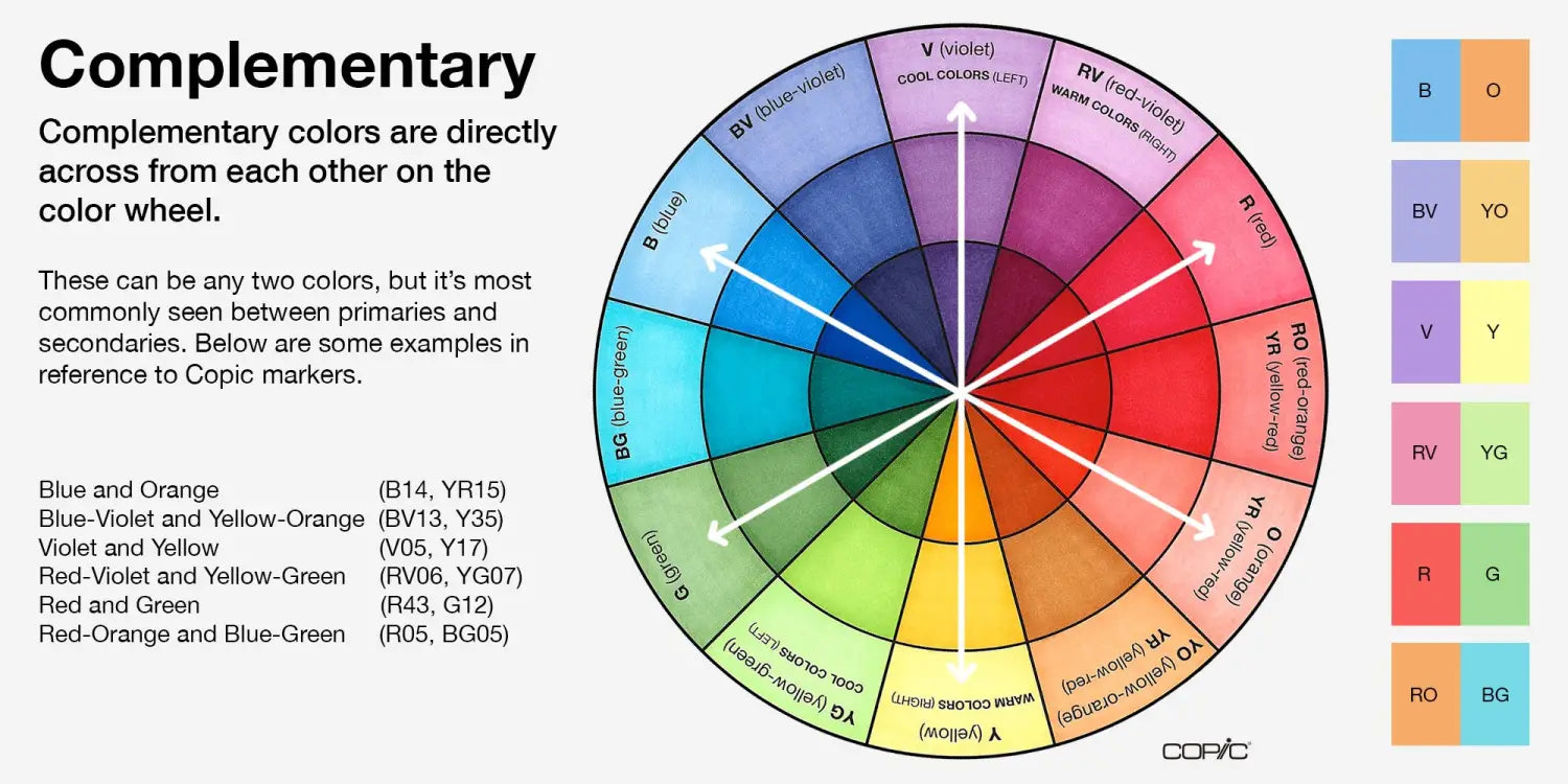
Next, we have complementary! Complementary colors lie directly across the color wheel from each other and create a powerful duo. Think of some of your favorite sports teams, the LA Lakers use violet and yellow on their jerseys, the Chicago Bears use blue and orange, and, well, there’s probably no sports team with red and green colors due to its association with the holiday season, but you get the picture! Complementary colors show a natural balance and always contain a warm and a cool color.
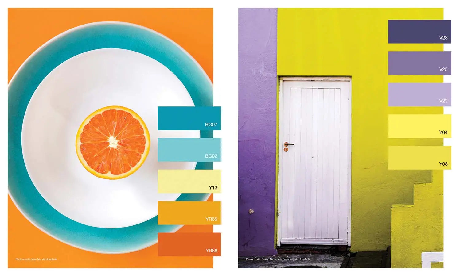
Let's take a look at the complementary examples above. The photographer’s placement of the sliced orange on a white, and then blue, plate was a clever way to make this fruit stand out. The colors contradict each other and create a more interesting image than, let’s say, if the plate was red or yellow-green. In the other example, a white door stands between violet to the left and yellow to the right. These colors appear very bright and create the most amount of contrast you can get! This is definitely a great way to make your home stand out among the rest!
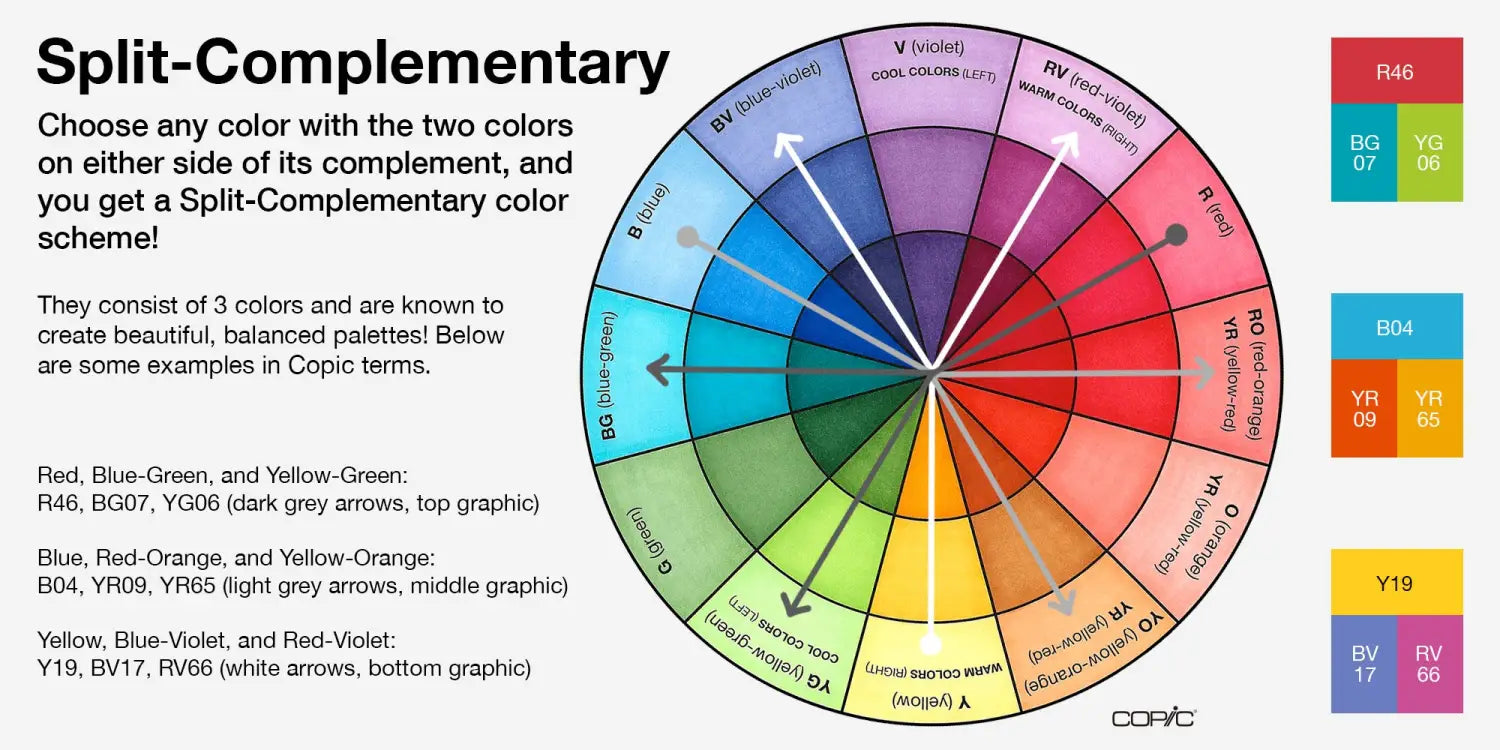
Last but not least, a split-complementary color scheme uses two colors across the color wheel, with those two colors lying on either side of the complementary color. For example, violet’s complimentary color is yellow, but its split-complementary colors are yellow-green and yellow-orange. This color scheme can be seen in nature quite often with flowers! Take a violet pansy, for example, and its yellow-orange highlights against yellow-green leaves. So pretty!
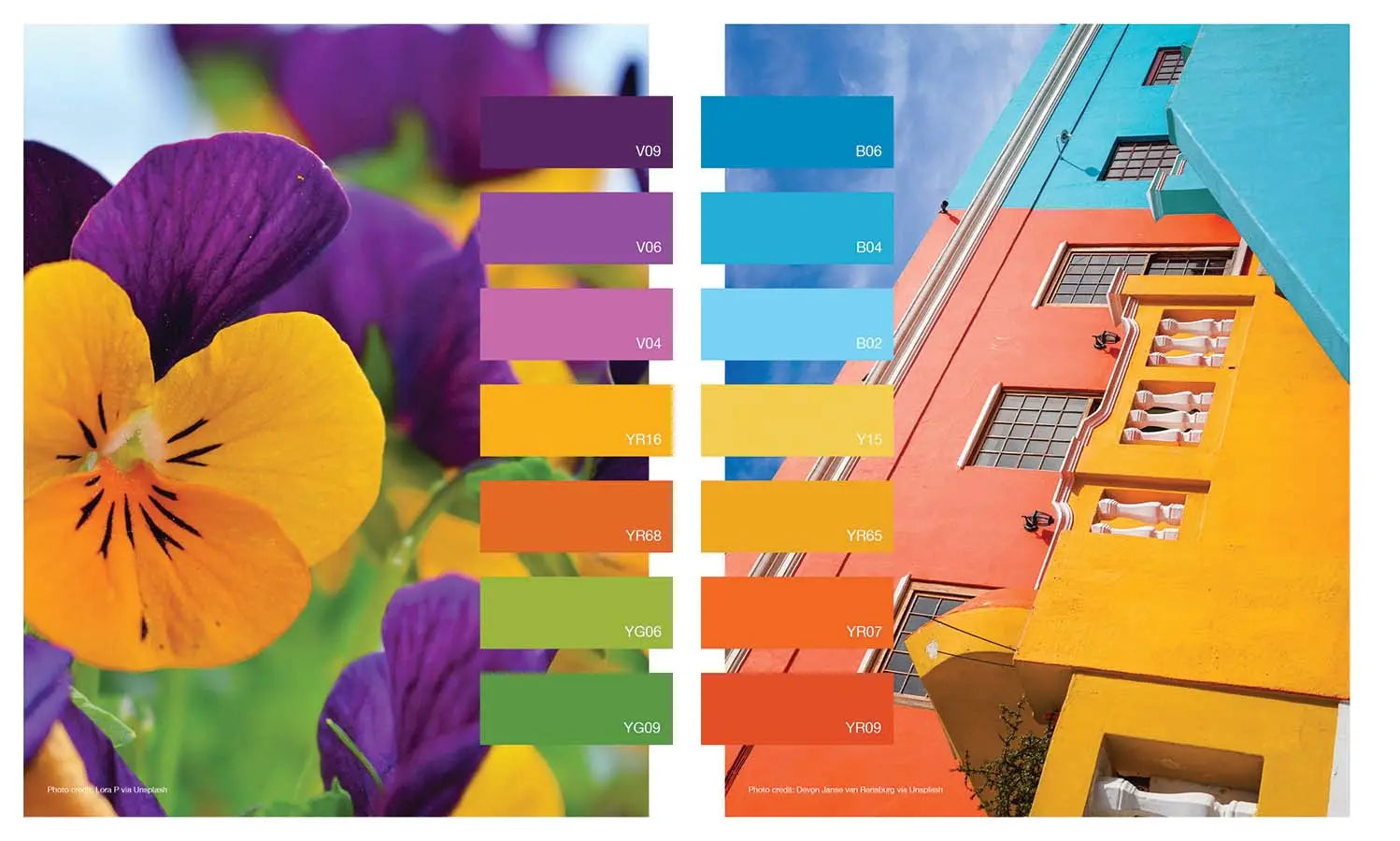
Also, in the architectural example above, you can see just how well the blue stands out alongside the red-orange and yellow-orange segments. This split-complementary color combination creates a bold, but beautiful palette for the exterior of this building, and it will most certainly stand out among any neutral tone structures near it!
That wraps up our first blog on color schemes! We’ve introduced what analogous, complementary, and split-complementary palettes entail, and later in the month, we’ll show how you can apply these color schemes using Copic markers to your own illustrations! Until then!